Monday, April 16, 2012

Evaluation Four

How did you use media technologies in the construction and research planning and evaluation stages?


There were several media technologies in which i used throughout the construction and planning of my music video such as the use of YouTube, the social networking site Facebook and a website in which i was able to create a survey called SurveyMonkey. Other media technologies that i used included different pieces of camera equipment and computer programmes such as FinalCut Pro. All of which have helped me create my final product. 


During the research and planning part of the project i used the internet for many different search places such as Google. This allowed me to find and view different artists digi-packs, posters and websites enabling to find out the best layout to fit my genre and music video. YouTube was also a main feature which helped me to research artists who fit into my 'Indie' genre and allowed me to watch their recent music videos, this let me grab some information and lots of different ideas for my final piece. 


Screen grabbing has been a very important part of this project as it has allowed me to grab images from the internet of clips of videos and photos which i then put onto my blog which all helped me create my finished piece. 


Another internet programme that i used was Blogger. This website allowed me to keep a blog of what i was doing and of what stage i was at. This website easily allowed me to upload screen grabs that i had taken of my various research. Blogger also provides a comment box in which i am able to receive feedback from. 


Throughout the journey of making my own music video i have used both an iMac and a MacBook Pro. This has let me use many programmes such as iMovie used for short films, iPhoto to store and edit images, iCal to help me keep track of my progress and time keeping, Photoshop to crop and create new images, and also Final Cut Pro which i have used to create my final product. All of these programmes have helped store and create different pieces all of which have gone into my final piece.


The camera which i used to produce my music video was a key piece of equipment. I used a Canon 7D to both film my music video and take pictures for my ancillary tasks. I also used a tripod to keep the camera steady which would help make my filming and final product look more professional.


Evaluation Three

What have you learned from audience feedback?


In order to receive some feedback of my video I published my music video on the social networking site facebook so that it was open for everyone to see and comment on. This would allow me to recognise any issues with the video which I would after need to change. I received some really good feedback and most people enjoyed my final movie however some said that the music that I chose was not to their preferred taste. After hearing back from over twenty people I have learned that perhaps I should of had more shots of her singing (even though a lot of people like that she wasn't singing much) and have more location shots.


After everyone had finished their music video we had a feedback lesson where we all watched each others videos and gave some constructive criticism to everyone in the class. We posted on the wiki which was made for all of the class to interact and talk about our work, this allowed us to keep a record of the feedback which we received. The feedback for my poster was to have a different font so I took this on board and changed my poster, the final piece that was created everyone thought was better and looked more realistic. 

Evaluation Two

How effective is the combination of your main product and ancillary texts?


Both my main music video and my ancillary tasks worked well together as i worked out my final idea which made it easier to provide enough footage and images to help both my music video and ancillary tasks. Everything carried the same theme throughout which was mainly indie, this worked well with the genre of my music video and how my ancillary tasks turned out. I feel that both my final film and ancillary tasks work well together as the images that i have used are in both my video and poster and digi-packs. The pictures were taken at the same location as where i shot my music video.

These related due to many things, one of which was the costume that my actress was wearing. This changed throughout the video however in some of the footage it is the same as in my ancillary tasks such as the digi-pack. I felt that the costume that my actress was wearing linked well with my Indie genre and helped the audience recognise this.

I used the same fonts throughout my digi-pack and my poster. I chose the same font so it would become her 'signature' font and would be recognised throughout. I felt that the font worked well as it wasn't too bold but it was noticeable which i think fits in well with the Indie genre. I changed the font in which i used for my lyric book as he font would not be as large as the font on the front of the digi-pack so i chose one which would be easier to read but still carrying on the sense of the Indie genre. 

I tried to keep the same tones of colour throughout my video and ancillary tasks by using light filters on the front of my digi-pack and editing the final image for the finished poster. The colour i wanted to stick to was a neutral colour which would have mean provided by the natural light at each location that i filmed in. I decided this due to some of the research that i did with Indie artists. However i decided to add a hint of pink tones on my digi-pack to make it more interesting and stand out more.


Here is the front cover of Gabriella Cilmi's digi-pack. There is clear use of a simple font and a portrait shot of the artist herself. I decided to do the same for my digi-pack. As you can see i have used my own image that i have taken of the artist taken at one of the locations where i filmed and used a simple yet effective font.


Evaluation One

In what ways does your media product use, develop or challenge forms and conventions of real media products?


Poster


I think that in a few ways my poster has challenged the conventions of a music poster. For a start the image which I photographed myself was not posed, it happened that I captured her when she was laughing. In many music posters (as seen below) the front image is normally posed in an artificial setting. I think that the colours in my poster work well with the genre of my song, something calm and mellow works well with neutral colours which is what i have tried to stick to also helping the advertisement of hmv to stand out. My poster is conventional for a music poster for the company hmv as i downloaded the correct font and the right logo's and stayed with the same colour theme. A key thing to post on a music poster is the cover of the album. I felt that the final cover to my digi-pack didn't stand out enough as it had the same colours as the image on the poster therefore i chose to use the cover of my practice digi-pack instead as i felt that the contrast worked a lot better. It is very important for everything to be clear and stand out to the consumer so the company is recognised and so that the poster and CD also look appealing.
Digi-pack

 I made sure that I stuck to most of the normal conventions used in a digi-pack such as the barcode, music company and regulation copyright text. All of these allow me to look as professional as possible whilst sticking to the guidelines off a conventional digi-pack. The text that I have put around the disk stick to the legal requirements of copyright, again enabling me to make my final product look as professional as I could.
The main picture on my digi-pack I took myself along with the other images throughout the digi-pack and lyric book. I decided to add a light leak to it so it wasn't too similar to the inside page. I think that the simplicity of my front cover sticks to most conventions of a digi-pack as I have tried to stick to a colour theme which matches my genre of music. The pictures which are featured in the lyric book are all my own too. I tried to follow the theme of her walking which is a scene in my final music video so I took a picture each step she took to make the background of the book. The unedited images that i took were all very neutral tones of browns and yellows however I decided to add a slight hint of pink so that it wasn't too boring, this also matches the colour of the disk. Sticking with the neutral theme I didn't make the pink too bright as it would have distracted away from the locations of where the photographs were shot. The location where I took the images is at the same location as where some of my final film was shot which links in nicely. 


After comparing my digi-pack to others such as Colbie Caillat I feel like mine is very similar as keeping to the neutral tones and chilled out look. It is clear that my images shown above and on my contact sheets are similar to those of other artists who's genre is the same or similar. The same font that I have used throughout my digi-pack and poster maintain the most professional look that I could achieve and follow the conventions of a unique, real, media product. 


Friday, March 16, 2012

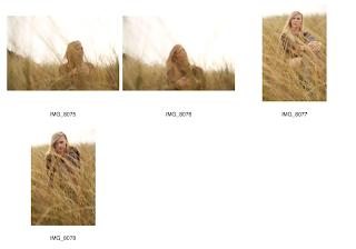
Contact sheets.

Here are a few images of Georgie that I took so I could use them for my digi-pack.

I took these images at the location of part of my music video. The weather wasn't very good and the sun wasn't out however the photographs worked really well on auto mode on the camera. I used depth of field on the camera so that the grass was out of focus and Georgie was in focus. I have changed some images to that they have a pink tint which would go with the theme of my digi-pack. Other images I have kept completely original as the natural light gave it enough light and the contrast worked out really well.

Final Digi-Pack

This is my final digi-pack, I have used my own images that I took myself.


Here is my final Digi-Pack


I used a pink tone throughout my digi-pack so that it kept its mellow feel with a hint of colour to make it more interesting. I used the same font throughout the whole digi-pack. I used the same album company that Lana Del Ray is with as I am using her song.  


Here is the lyric book which is part of the digi-pack. I used my own images and edited them so that they had the same pink tint to match the rest of my ancillary tasks. 


Tuesday, March 13, 2012

Final Poster

For my final poster I used one of my own images which i thought would fit well. I really like the image that i used as it uses depth of field which works well with the text that i have put over.
My poster features the Artists name, the title of the Album and Tour dates. Including the necessary logos and images that are normally shown on a Music Poster. 


After researching more about different types of music poster i decided to change the design of mine. I changed the font and changed the layout.


Practice Digi Pack

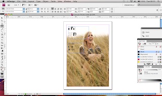
I made this digi-pack for my Artist on InDesign. I am really pleased with the way it turned out however I did not use my own images therefore I will make a new digi-pack with a set of my own images.


Thursday, March 8, 2012

Final Music Video

Practice Music Vid

Here is a music video which was created by myself and a couple of other students in the class. We each took turns on filming parts of the video and all came together and decided on different angles which we could use during the video. This task was to allow us to explore with the equipment and to see what looked best, it also allowed us to focus of lip syncing the final product.

Wednesday, February 22, 2012

Ideas and Equiptment

Holding Camera - and spin
Big Chair/Ornament
Words on cards
Laughing changing to upset
Close up
Pan shot - splash
Shaky Cam
Time Lapse
Lighting
Slow
Water
Beach                                                               Canon 7D
                                                                         Tripod
Bright Light


Monday, February 6, 2012

Andrew Goodwin Theory

1. Music videos demonstrate genre characteristics/conventions (e.g. stage performance in metal video, dance routine for boy/girl band)


http://www.youtube.com/watch?v=Bag1gUxuU0g&ob=av2e


Purity - white dress
power - tigers
church - religious - purity
2. There is a relationship between lyrics and visuals
(either illustrative, amplifying, contradicting)


The visuals in my music video both illustrate and amplify the lyrics. An example of when the visuals illustrate, is in the first verse of the song and the lyrics say, “And I was bouncing on my feet,” whilst the visuals show Heidi doing the ‘running in a very bouncy motion. When storyboarding my music video, I knew I wanted a ‘bouncy’ dance move of some sort to go with these lyrics.
There are also moments when the lyrics say, “Summer Love,” and heart shaped hand gestures are made by the protagonists of the video or an image of a heart appears on screen. Towards the end of the song, the lyrics say,“Kissing my baby, driving me crazy,” at which point, Heidi blows a kiss to the camera and does a crazy dance, literally illustrating the lyrics. This was also planned in my storyboard.
Also, a lot of the lyrics in my music video appear as if they are being sung by either me or Heidi. So, I suppose this is a way of amplifying lyrics, as they are not only being heard but also being seen by the audience. Because the song is very rhythmical, there usually is an edit after every phrase sung in the song, so not only is there a relationship between the visuals and lyrics but also with the rhythm as well.
3. There is a relationship between the music and visuals
The visuals in my music video are either illustrating or amplifying the music. For example, throughout the video the editing has been made very smooth which goes together with the type on song. 
In the song, there is also a distinctive drum beat and guitar motif. There are shots in my music video showing myself playing the drums and guitar in sync with the music. I have also created a little cartoon character playing the horns when the horn solo starts. These shots are literally illustrating the music as they show the instruments used in the song.

4. The demands of the record label will include the need for lots of close ups of the artists and the artist may develop motifs which reoccur across their work (a visual style)
There are certainly a lot of shots (all close up, mid and long shots) of myself, who is representing the figure of Michael Jameson (the artist).
Looking at my magazine cover and album digipack with my music video, the vibrant colours and silhouette figures in dance poses are both reoccurring motifs across my three pieces of work. When making each of these it was important that they all linked together in some way so my target audience can recognise my visual style immediately. If I were to be a successful and popular music artist, my colourful visual style and silhouette imagery would probably become iconic to my name.
5. There is frequently reference to notion of looking (screens within screens, telescopes etc and particularly voyeuristic treatment of the female body)  
Heidi wears big sunglasses in my music video which refers to the notion of looking. The sunglasses perhaps could symbolise the idea of taking a closer at things, such as the meaning of the video, the moves of the female dancer and the clothes in which the female protagonists wear. However there are no sexually suggestive shots of the female body as this does not really fit in with the genre of the music video. There are moments when Heidi also pulls down her shades and looks directly at the camera creating a more intimate relationship with the audience.
There is also a lot of symmetry and colours within the music video, some people may interpret this as looking through a kaleidoscope, as these elements of the video are not dissimilar from kaleidoscope imagery.

6. There is often intertextual reference (to films, tv programmes, other music videos etc)
The costumes used in my music video have reference both to 80s and New Jack Swing artists such as MC Hammer, Abba, Madonna, TLC, Michael Jackson, Rick Astley, Guy etc. The dance moves are typical of Bobby Brown and Michael Jackson whereas the colourful and vibrant themes of the music video is a big reference to the 80s decade in general.